Short version: Fast delivery in Korea is not about speed alone. It is about systems that remove waiting as a default condition.
This post looks at how delivery became ordinary, what makes it reliable, and why it feels different from many other countries.
Delivery works best when the city itself supports short distances and clear routes. (Photo: Unsplash)
① What People Notice First
Visitors often mention the same surprise: delivery feels fast even when it is not rushed. Orders arrive within hours, sometimes minutes, without constant checking.
The experience feels calm rather than urgent, which is unusual for something described as “fast.”
② Speed Is Not the Only Metric
Predictability: estimated times are usually accurate
Coverage: services operate late and across dense areas
Integration: payment, tracking, and communication are unified
Defaults: delivery is assumed, not exceptional
Speed matters, but reliability changes how people plan their day.
③ Why Delivery Scales So Well
1) Short distances add up
Dense housing and mixed-use neighborhoods mean riders travel shorter routes. Time is saved not by moving faster, but by moving less.
2) Orders cluster naturally
When many people order similar things at similar times, routes optimize themselves. Delivery becomes a flow, not a series of exceptions.
3) Platforms reduce coordination costs
Apps handle matching, payment, and updates. Human attention is reserved for edge cases, not routine steps.
4) Customers are part of the system
Clear instructions, standardized addresses, and predictable expectations reduce friction on both sides.
④ A Small but Important Detail
In many cases, no interaction is required at delivery. Items are left safely, photos are uploaded, and confirmation is automatic.
This removes interruption from the experience, which may matter more than speed itself.
Non-interruptive delivery changes how people perceive waiting. (Photo: Unsplash)
⑤ What This Changes in Daily Life
When delivery is reliable, people stop planning around it. Groceries, meals, and small necessities become background tasks.
The result is not convenience alone, but a subtle shift in how time is allocated.
⑥ Summary
Fast delivery in Korea is built on predictability and density.
Systems reduce waiting rather than accelerate movement.
Reliability reshapes daily planning.
This post contains affiliate links. I may receive a small commission at no extra cost to you.
Korea, Observed: Convenience Stores Are Not Just Stores
Short version: In Korea, convenience stores function less like small shops and more like neighborhood infrastructure.
This post looks at what people actually use them for, why the format works so well here, and what it reveals about everyday life.
Convenience stores function as small pieces of neighborhood infrastructure. (Photo: Unsplash)
① The First Impression
At first glance, a Korean convenience store looks familiar. Bright lights, narrow aisles, shelves filled with snacks and drinks.
But after a few days, many visitors notice something different: people are not just buying items. They are staying.
Someone heats a meal and eats at a small table. Another prints a document. A delivery driver tops up a transit card.
The store feels less like a retail stop and more like a shared utility space.
② What People Actually Use Convenience Stores For
Meals: hot food, microwaves, utensils, seating
Payments: bill payments, gift cards, prepaid services
Logistics: parcel drop-off and pickup
Daily supplies: umbrellas, chargers, socks, basic medicine
Time buffers: waiting, cooling down, short breaks
The range matters less than the reliability. People know what they can expect, almost anywhere, at almost any hour.
③ Why This Model Works in Korea
1) Density makes proximity valuable
In dense neighborhoods, a store that is always nearby reduces friction. You do not need to plan. You simply step in.
2) Standardization builds trust
Chains operate on consistent layouts, pricing, and services. This predictability turns the store into something closer to infrastructure than retail.
3) Time matters more than variety
The selection is curated for speed, not abundance. The goal is not choice, but resolution.
④ A Quiet Cultural Detail
Convenience stores also function as socially neutral spaces. No reservations, no expectations, no obligation to leave quickly.
You can exist there briefly without explanation.
That small detail explains why they are used so widely and so casually.
⑤ What This Reveals
Korean convenience stores show a preference for systems that reduce small daily decisions.
They trade depth for reliability, and novelty for speed.
Seen this way, they are less about consumption and more about continuity.
⑥ Summary
Convenience stores act as everyday infrastructure.
Their value lies in predictability, not selection.
They absorb many small tasks people would rather not plan.
This post contains affiliate links. I may receive a small commission at no extra cost to you.
Korea, Observed: Why Everything Seems to Need an App
Short version: In Korea, many daily tasks flow through apps—not because people love apps, but because apps are the cheapest way to make fast, reliable systems at scale.
This post explains what tends to require an app, why the pattern emerged, and how to navigate it without turning your phone into a second job.
Smartphones act as everyday infrastructure in Korea. (Photo: Unsplash)Mobile payments and QR-based interactions are common in daily routines. (Photo: Unsplash)
① The Observation
If you are new to Korea, a familiar moment arrives quickly: you want to do something ordinary—order food, reserve a table, track a package, call a taxi, pay a bill, confirm an appointment—and someone says, “There’s an app for that.”
What surprises many visitors isn’t that apps exist, but that the default path often runs through them. In some places, the “non‑app” option exists, but it is slower, less transparent, or more expensive.
Admin conveniences: bank authentication, document verification, two-factor sign-ins.
You can survive without mastering every service. The trick is recognizing which categories are “app-heavy” and setting up a minimal toolkit.
③ Why This Happened (Without the Hype)
1) Apps are cheaper than people
Korea’s consumer services compete aggressively on speed, reliability, and price. When margins are tight, it becomes hard to staff call centers, maintain manual systems, and handle endless edge cases.
An app turns the customer into the last-mile interface: you select options, confirm details, accept terms, and track progress. That’s not inherently bad—it’s an efficiency trade—but it explains why apps become the default.
2) Dense cities reward real-time coordination
In dense urban areas, small delays compound. Real-time updates (arriving in 3 minutes vs. 10) matter. Apps are the simplest way to coordinate drivers, couriers, queues, and inventory at street level.
3) “Trust” moves into the system
Many Korean services embed trust into the platform: verified accounts, transaction histories, ratings, ID checks, and delivery confirmations. The app is not just an interface; it’s the place where identity and reputation live.
This can make services feel smooth once you are inside. But it can feel like friction at the beginning, especially if you’re used to anonymous “just pay and go” experiences.
4) Convenience is built around defaults
Once a population adopts a default workflow, the ecosystem optimizes around it. Coupons become app-only. Customer service assumes you can send screenshots. Receipts arrive digitally. At that point, the “no app” route becomes a special case.
④ The Hidden Cost: App Fatigue
There is a quiet downside: app fatigue. Too many apps mean too many logins, permissions, notifications, and terms. Convenience becomes maintenance.
What looks like a “digital paradise” from the outside can feel like a constant stream of micro-decisions on the inside: update now or later, allow location always or only while using, enable marketing notifications or not.
The goal isn’t to reject apps. The goal is to minimize the mental overhead while keeping access to the few services that genuinely improve daily life.
Some services rely on additional identity checks, especially for payments and membership benefits. Treat it like setting up a key: annoying once, invisible later. If you’re visiting short-term, don’t over-invest—focus on the apps that reduce friction immediately.
“Why are notifications so noisy?”
Because many services treat notifications as marketing. Turn off promotional pushes early. Keep only transaction-critical alerts (delivery updates, payment confirmations, reservation reminders). Your phone should feel like a dashboard, not a billboard.
“Why does everything want my location?”
Because location is a shortcut for speed: nearby stores, faster matching, ETA accuracy. A balanced approach is to allow location only while using, except for the one app where background location is clearly beneficial (for example, certain mobility tracking features).
⑦ What This Says About Korea (Beyond Apps)
Korea doesn’t “love apps” in a romantic way. Korea tends to love fast, predictable flows. Apps are the cheapest infrastructure to achieve that at national scale.
That’s why many Korean digital experiences feel less like “cool features” and more like plumbing. When it works, nobody notices. When it breaks, the whole day feels slower.
In that sense, apps in Korea are not a trend. They are a visible layer of a deeper preference: reduce friction, standardize steps, keep the line moving.
⑧ Summary
Apps became the default because they lower operating costs and coordinate dense-city logistics.
The upside is speed and transparency; the downside is app fatigue.
The best strategy is a minimal toolkit: a few core apps + situational add-ons.
Think of Korean apps as infrastructure—useful, but not worth collecting unnecessarily.
Optional: links you may want to add later
If you plan to monetize with affiliates, place links here in a neutral, helpful way:
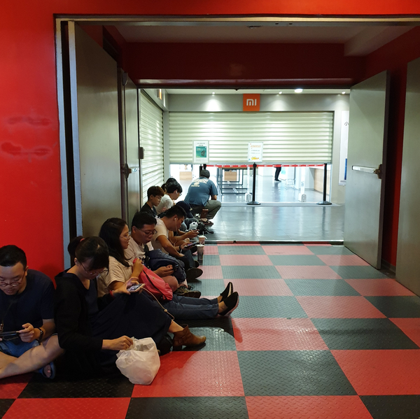
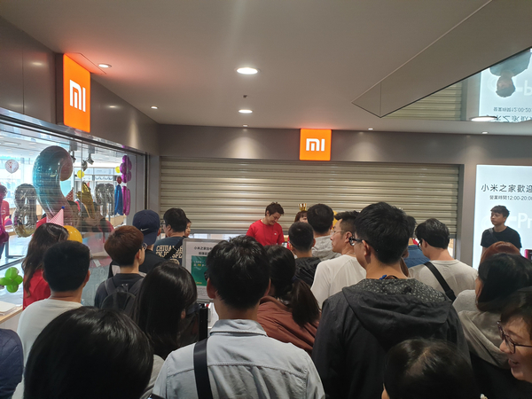
지난 타이중 여행에서 얻은 작은 행운 하나 있었습니다. 4일동안 묵은 호텔 아래층에 샤오미홈이 있었거든요. 구경이나 한번 할까하고 갔는데 문도 아직 열지 않은 매장 앞에 사람들이 줄을 서서 앉아 있는 길래 무슨 일인가 하고 살펴보니 뭔가 행사를 하는가 보더군요.
샤오미 미밴드4 하나를 사면 추가구매시 99 TWD. 1개 가격은 900 TWD. 하루 50개 한정. 해당 매장이 오픈 2주년이되어 하는 행사였습니다. 완전 횡재. 한국에서도 안서본 줄을 외국에서 서봤네요.
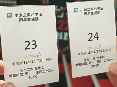
12시 오픈인데 10시 부터 줄을 서고 있더라구요. 그래서 와이프와 함께 줄을 섰습니다. 11:30분부터 번호표를 나눠준다고 되어있어서 일단 줄을 섰습니다.
번호표를 받고 오픈 5분전에 밀집대형으로!!
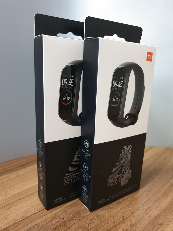
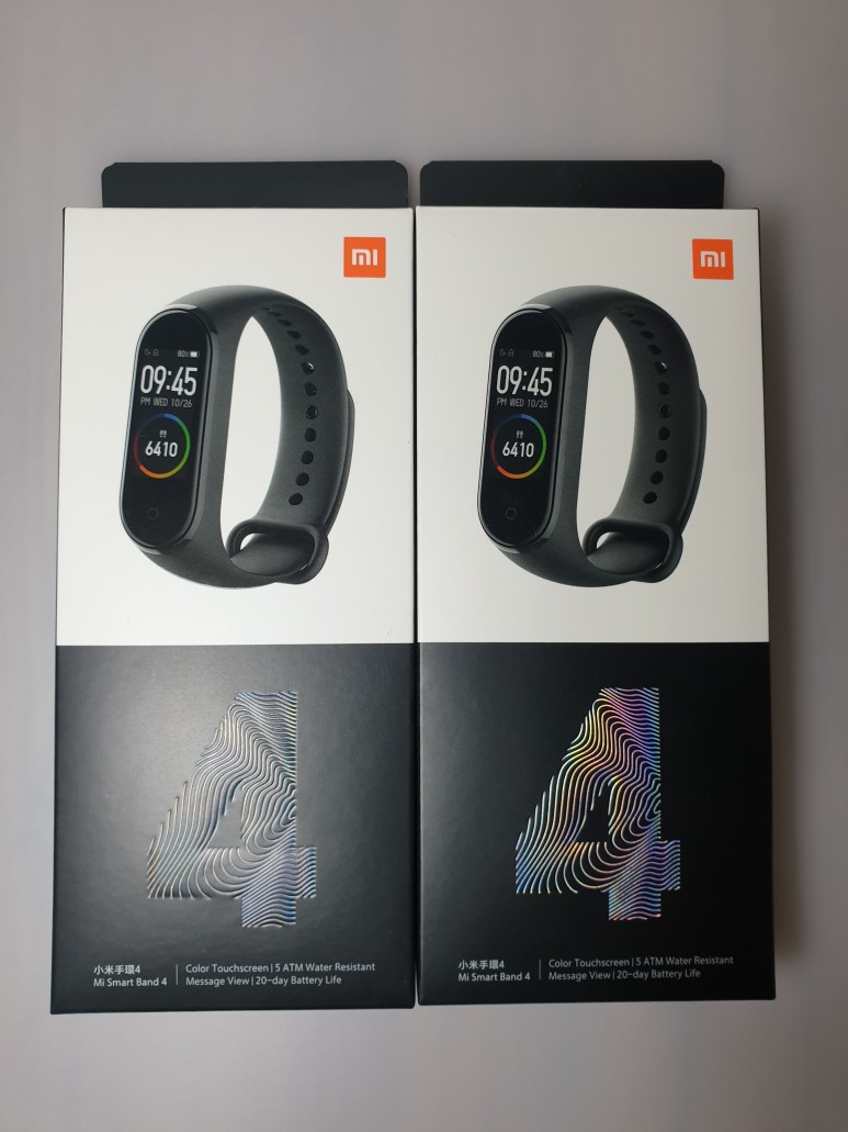
인당 2개씩 살 수 있었는데, 와이프가 개당 $99 인줄 착각하고 저까지 사라고 했으나 2개 가격이 $999 인 것을 알고 2개만 사자고 해서 2개만 사왔습니다. 걍 4개 사면 안될까? 라는 말이 목 근처에서 왔다갔다 했으나 원래 다른게 사고 싶었던지라 참았습니다. 새로나온 Mi watch 가 사고 싶었지만, 아직 대만에도 출시가 안되었고 어메이즈핏 빕은 한국에서 주문하는게 더 싼 관계로 패쓰. 나중에 한국에 돌아와서 더 사올걸 하고 와이프가 좀 후회를 하긴 하더군요.
암튼 개당 $900 원짜리를 두개 $999에 샀으니 일단 성공!
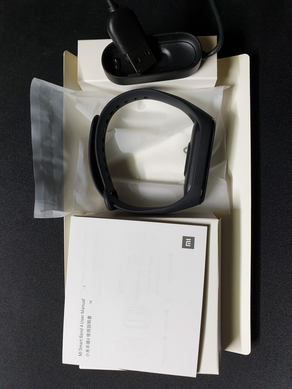
일단 내부 구성은 간단합니다. 설명서, 밴드와 본체, 충전기.
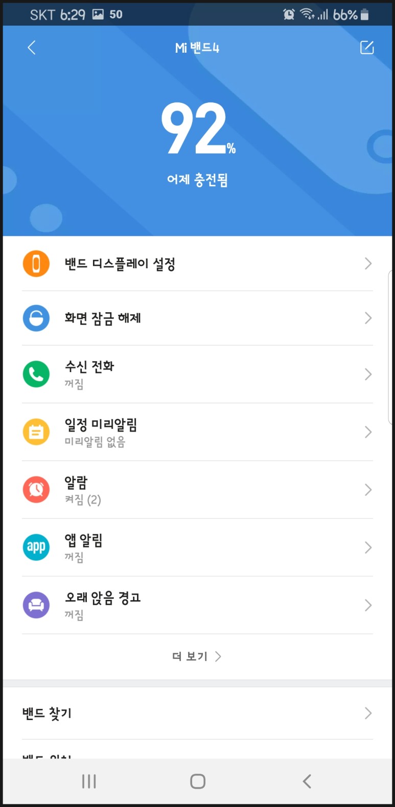
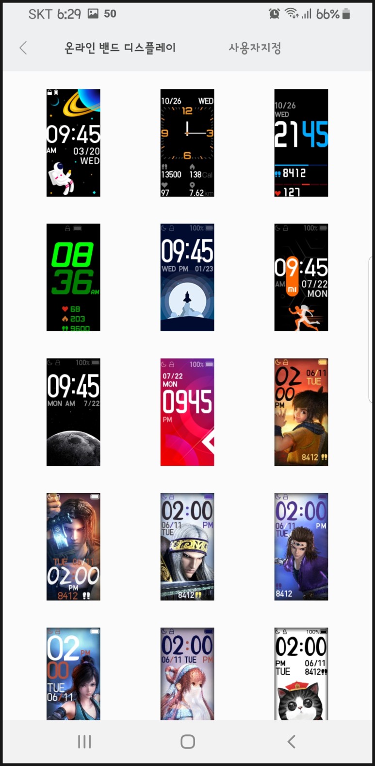
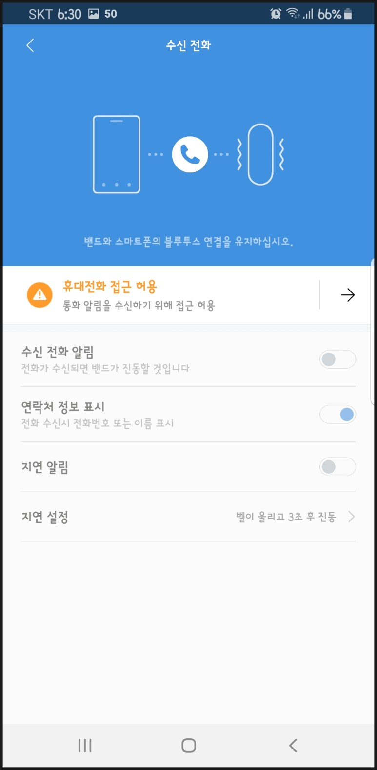
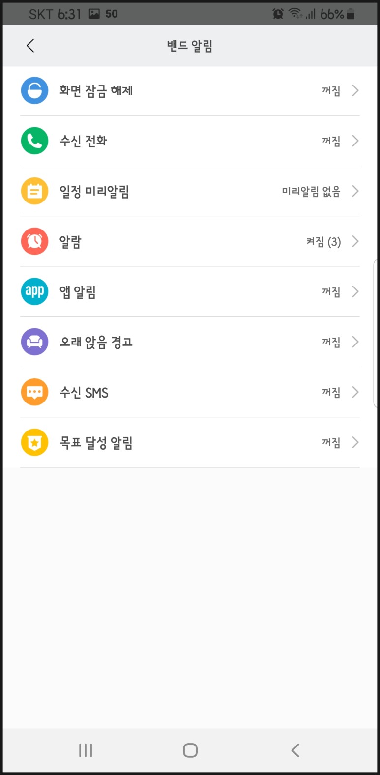
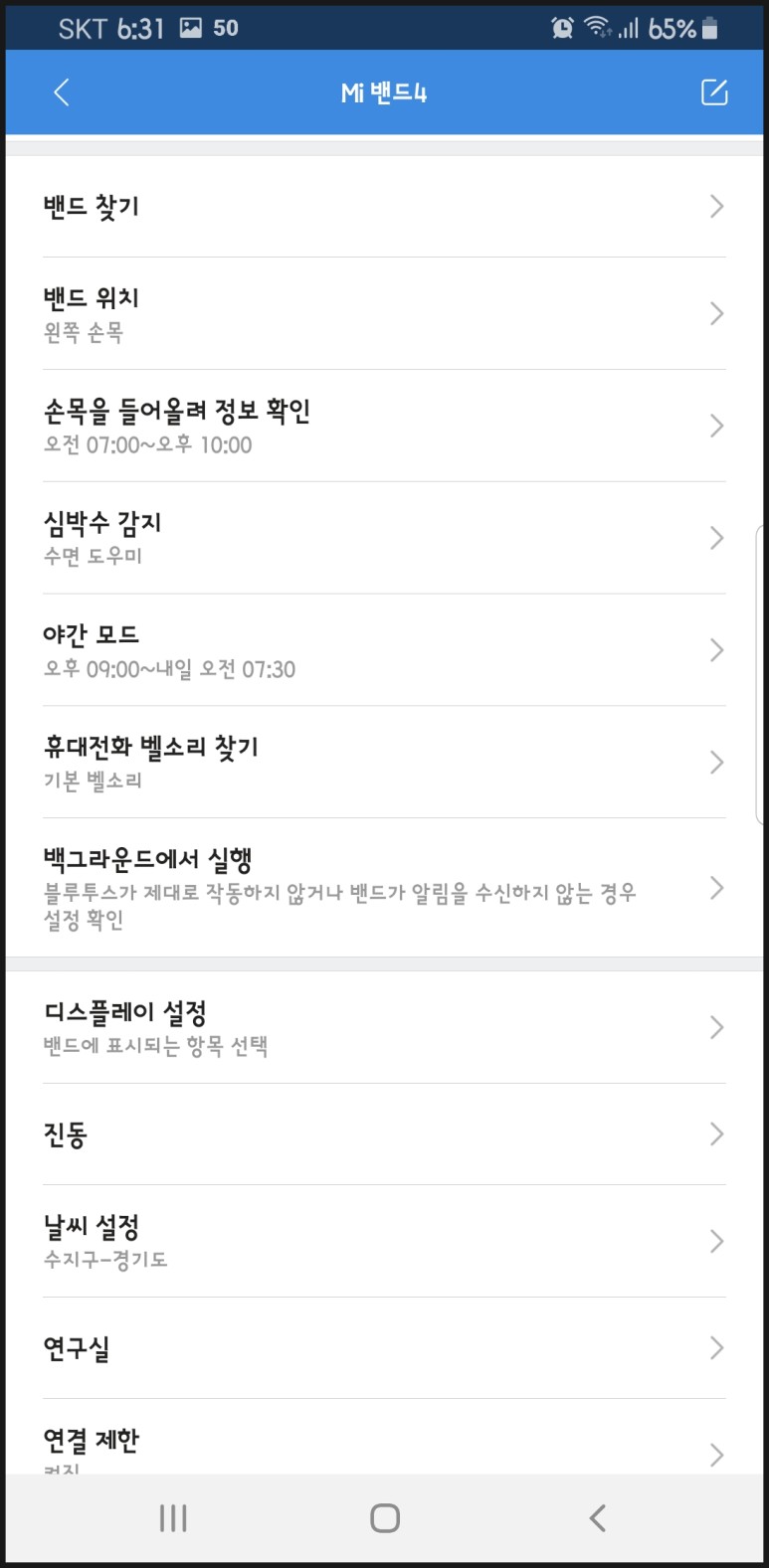
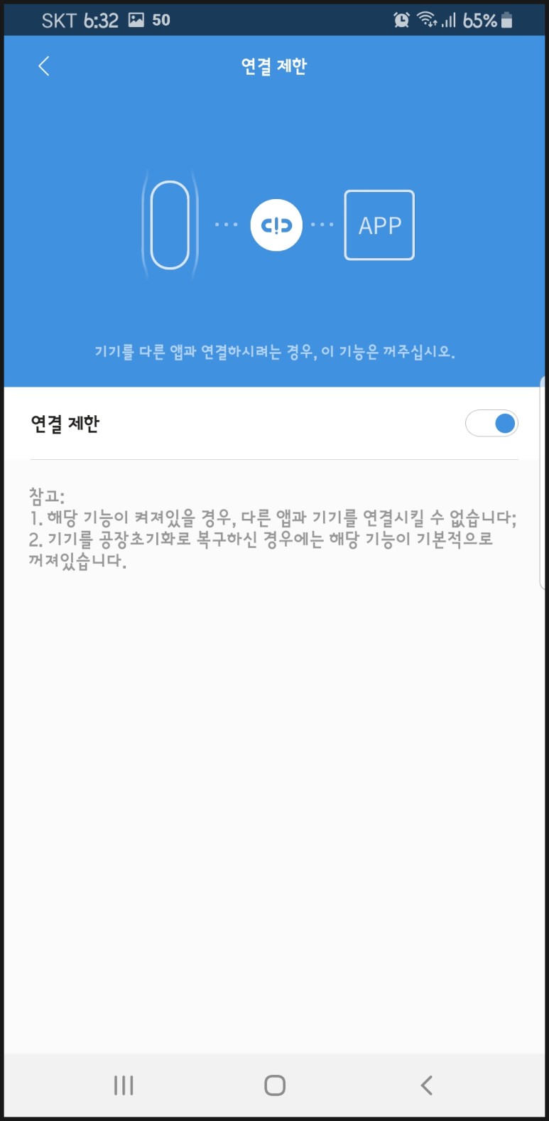
샤오미 미밴드4 설정
일단 충전기에 꽂아서 충전을 시작.
사실 충전기에 처음 꽂고나면 페어링부터 하라고 나오지만 이미 페어링을 해서 요렇게 보입니다. 설정을 위해 스마트폰에 'Mi Fit' 앱을 설치합니다.
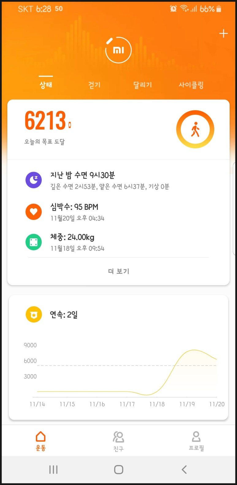
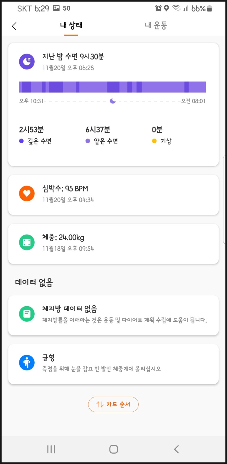
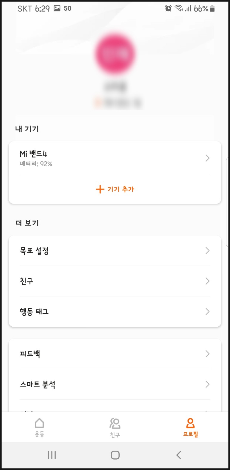
설치가 끝나고 나면 로그인을 하라고 나옵니다. 하지만 제가 쓸게 아니고 딸래미가 쓸거라서 제 구글계정에 연결한 뒤 딸래미 프로필로 설정을 해뒀습니다. 다행히 중국내수용이 아닌 글로벌 버전이라서 앱만 설치하고 언어 설정만 변경하면 그 뒤로는 간단합니다. 이름, 나이, 키, 몸무게를 넣으면 끝.
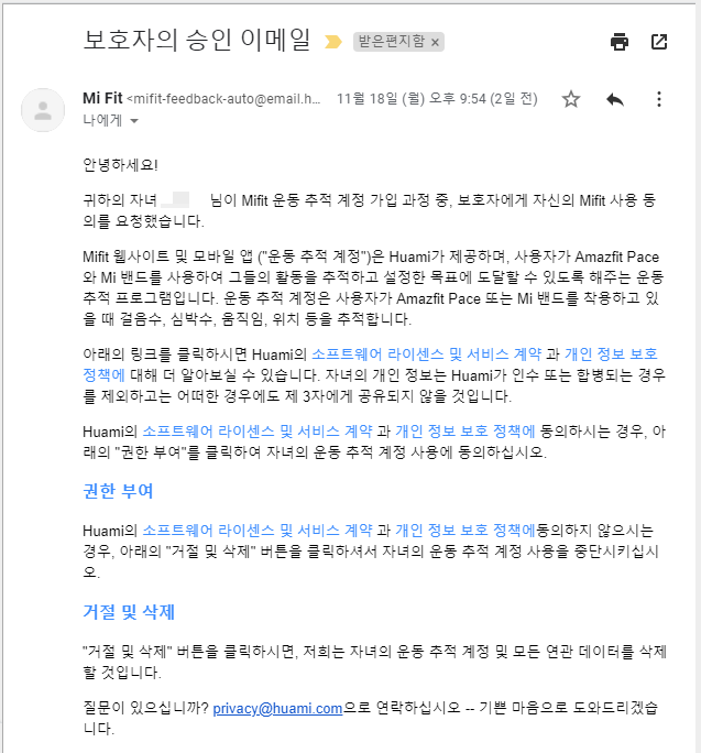
그러면 이렇게 자녀의 기기로 등록이 됩니다. 미성년자라 보호자의 승인이 필요합니다.
둘째딸은 스마트폰이 없어서 제 스마트폰에 연결을 해서 설정을 하였고, 첫째딸은 이미 스마트폰을 가지고 있기 때문에 사용중인 스마트폰에 연결해 주었습니다. 그래도 구글 Family Link 를 걸어두었기 때문에 저에게 메일이 오게됩니다. Family Link 를 걸어두지 않았더라도 보호자 메일을 제 것으로 설정할 수도 있습니다.
Family Link 가 뭔지 궁금하시다면 차후에 관련 글을 한번 쓰겠습니다. 쉽게 말하자면 구글에서 만든 자녀 기기 관리 어플입니다. 일단 여기서는 패쓰.
아이들은 상당히 만족해 하면서 사용중입니다. 매번 핸드폰을 아무대나 던져두기도 하고 학교나 학원에서 무음으로 해놓아도 학원버스 시간에 맞춰 둔 알람도 지나치지 않을 수 있어서 좋더군요. 스마트폰에 한번 연결해서 설정을 한 다음 단독으로 사용도 할 수 있으니 자녀용으로 사용하기 좋은 것 같습니다.